Tips for Designing a Killer Level
DeadMeat's Design Tips
(DDT!)
Note: this guide was written specifically for Quake maps. Most of the concepts
apply to Hexen2 and Quake2 however.
Now that you've progressed through all the lessons
in this tutorial, you know everything I know about using BSP to create
a Quake level. With that knowledge in mind, you can crank out levels
in fairly short order. But, how do you insure that anyone will
actually want to play your level? How do you turn your idea into a
truly Killer Quake level? Hopefully, this page will guide you down the
right path to help you turn your map into a work of art that people
will want to play again and again. (Sounds pretty ambitious doesn't
it?)
Actually, it's not that hard to make a Killer Quake
level, but it requires you to remember a few simple guidelines as you
go along. Now, before we go any further, let me say this: The tips and
ideas I present here are based on my personal preferences. I've said
repeatedly that I'm no artist, but I know what I like. You aren't
required to follow the suggestions I make here. But, if you do, you
might find yourself making a better level than you first thought
possible. However, if you don't like something I suggest, feel free to
ignore it and do something different. It's your level after
all. Now, with that out of the way, let's get started...
Textures
One of the best things you can do to make your
level look good is to choose textures which go together well and fit
the overall theme of the level. What's that? You don't have a theme?
Well, that's the first mistake people tend to make (I know, I've done
it!). They jump in making a level, building all sorts of cool
architectural designs, without even considering what type of level
they are wanting to build. What results is an eclectic mix of
medieval/military/wizard that may play all right, but doesn't earn the
title 'Killer'.
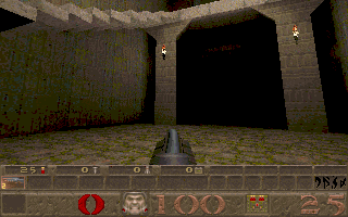
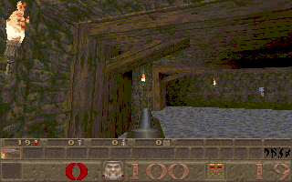
As an example, look at the screenshot below (this
is from a level I'm working on, by the way). This room contains a
combination of military (on the pillars) and medieval textures. It
doesn't necessarily look bad, but it looks a little out of place.
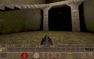
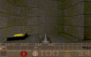
Now, here's a shot of the same room, with the
military texture replaced by a medieval type texture. Looks much
better, don't you think? Now it looks more like the pillars belong in
the room.
Of course, it's not just a matter of having similar
textures that make your level theme coherent. A lot of factors
contribute to how a world looks. For instance, you might build a
really detailed medieval-type world, then ruin it by putting a
flourescent light fixture in it. Sure, it's a little thing, but it can
really detract from your level's appearance. Remember you can set the
WorldType flag on your Worldspawn Entity so that the proper key
appears for the type of world you're building. That way a keycard
doesn't show up in a wizard's castle.
Another aspect of texturing to consider is the
alignment. This doesn't just mean that textures should be aligned
properly vertically and horizontally, even though that's important
too. The alignment I'm talking about is more subtle. Look at the
following two screenshots:
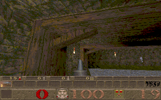
Which one looks more realistic to you? Most people
would say the second one, but why is that? Look at the diagonal
support beam. In the first picture, the textures on this beam haven't
been aligned, so what results is an un-natural look. No carpenter in
his right mind would cut a beam against the grain that way, even in
the Quake world.
Notice that in the second picture, though, the
texture has been rotated so that it aligns along the beam, making it
appear more like something you would see in the real world. It's a
small touch, but players notice things like this and it shows that you
care about the quality of your work. Besides, BSP gives you complete
control over texture rotation and alignment, so why not take advantage
of this? Your fans will appreciate it...
Lighting
One of the really cool things about the Quake
engine is the lighting that it allows you to do. Unlike Doom and other
similar games, you have nearly complete control over how your level is
lit. There are several entities that simulate lights (torches, flames,
flourosparks, etc.) along with the good old 'sourceless light' entity.
The light entities you place can be used to cast
cool-looking shadows and create dark, scary corners. Make full use of
this feature and your level's appearance will improve dramatically.
Now, when you're designing levels, you have two
choices. You can either put light entities in as you go or wait and
put them in last. I prefer the latter method, simply because it speeds
up compile time while I'm building a level. Plus, I can see the level
better with it being lit fullbright, so I know if the architecture is
what I want it to be. This is a matter of personal preference, so feel
free to use whichever method you choose.
What I recommend is to fully create your level with
no lights in it. Then, when it's nearly finished, put in any obvious
lights you want. These are entities that appear in Quake as lights
(torches, etc.). Put these around wherever you want so that your level
appears realistic, but not real cluttered. Be careful not to make
these entities too bright or the textures on nearby walls will look
weird.
Now, compile and run your level. There are probably
going to be dark spots between the entities you have put in. Is this
what you want? Is it too dark? If so, put some 'light' entities (the
sourceless kind) in the dark areas, but don't make them too bright.
The best looking levels have realistic light sources. You want the
player to think the light is coming from the items they can see, if
possible, but also remember, you can put light entities inside brushes
textured with the sky textures and they will shine through, giving the
appearance of light coming from the sky.
Another thing to remember. Torches and flames are
non-solid entities. The player can walk through them. For flames, this
is fine, but you might want to consider putting a 'trigger_hurt'
entity inside the flames so the player gets burned if he stands there
too long (a little touch of realism). For torches, the fact that the
player can walk through them kills their realism. For that reason,
it's a good idea to put torches a little above the player's head, so
there's no chance to walk through them.
One last thing before we leave lighting. When you
are completely finished with your level and are ready to release it to
the world, run LIGHT with the -extra command line parameter. This will
perform extra sampling on your map and provide you with a little
better lighting. The improvement isn't much, but it's noticeable in
most maps.
Secrets and Powerups
Quake players expect to find secrets from time to
time. In fact, part of the fun of a well-designed Quake level is
hunting for a Quad powerup that will let you dispatch that pesky
Shambler that's guarding the exit. Most levels seem to have 3-5
secrets and that's probably a pretty good number. You want a few to
make things interesting, but don't put in so many that your level
turns into a quest. Secrets in deathmatch maps can also be used to
hide armor or other stuff the player needs to survive.
There are a couple of things to watch for when
creating secret areas. First, make sure the player has a chance to
find it without just randomly shooting the walls in every room. This
gets old real quick and wastes ammo that could be needed to survive
later in the level. On the other hand, you don't want to make the
secret so obvious that it's not really a secret anymore either.
Remember, a secret is easy to find when you know it's there (and you
do, since you created it). Give the player a chance to find it, but
make him work for it :-)
One easy way to point out a secret door is to
create a mis-aligned texture on the door or use a slightly different
texture than the surrounding wall. Id does this quite a bit in their
levels. Look at the following screenshot from E1M6:
Now, it's obvious there's a door there. The means
to open the door isn't so obvious (shooting it won't work), but the
player knows to look around the area for something that will open the
door.
This is probably a good time to mention switch
placement. In this example, the switch that opens the door is located
high overhead where it's really hard to find, but still, it's right
next to the door. The thing I hate most is when a switch to open a
door is located clear at the other end of a map, then when you
activate the switch, there is no message telling you what happened. I
hate spending time flicking a switch repeatedly to see what it does.
Remember, there is a message key available on most entities. Use it
wisely and your players will appreciate it.
Another thing you might want to consider regarding
secrets is to make all parts of your map accessible even if the player
never finds the secrets. Some people don't care if they find the
secrets or not. They're out for blood and nothing else. So, don't hide
the key to the exit door inside a secret that the player might never
find. Also, it's a good idea not to hide valuable weapons inside a
secret room if the player needs them before he has a chance to find
that room. For instance, don't put the grenade launcher in a secret
area, then overwhelm the player with zombies before he gets to that
area.
Framerate Considerations
Note: some of the information in
this section came from a great article written by Steve Tietze (Rogue
Entertainment). The full text of his article is available
here; I'll just
summarize some of the high points on this page.
Perhaps the most important thing you can do to make
a level playable is to keep the amount of lag as low as possible. What
does this mean? Have you ever played internet deathmatch on E1M7?
Notice the way the screen lags when you stand in one corner and look
across the lava pit at the other corner of the room? That's lag,
caused by high polycount. You might have been lagging because of a bad
internet connection, but this made it worse. The reason for this is
that there are a lot of brushes in view from the position where you
are standing. The more brushes in view, the more work the Quake engine
must do to display the screen. Get this number too high and you get
lag.
I can hear you asking yourself, "Okay, that's
fine, DeadMeat, but how do I find out how many brushes are in view?"
Well, glad you asked. Quake has a very important console command that
you should learn to use when designing your level. Bring down the
console and type R_SPEEDS 1. Close the console and you'll see a string
of numbers scrolling across the top of the screen. Here is a
screenshot of E1M7, since I mentioned it earlier, with the R_SPEEDS
turned on:
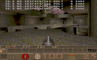
The first number you see on the left (32.8 MS in
our case) allows you to calculate an approximate frames-per-second you
are getting from the current view. To calculate the FPS, take 10
divided by MS * 100. Using our screenshot we get approximately 30 FPS.
That's not too bad, but could be better. This screenshot was taken at
320x200 resolution. Higher resolutions will produce slightly higher MS
counts, meaning lower FPS.
The next number you need to watch is the 3rd number
from the left (459 in the above screenshot). That number tells you how
many brushes the Quake engine is displaying in the current viewscreen.
If you want your level to be playable in internet deathmatch, this
number should stay below 450. You can get away with 500 or a little
higher in single player levels, but I wouldn't advise it. Now, keep in
mind that in the above screenshot, this is single player mode. If
there were 8 other players in here, the numbers would be higher as
there is more for the engine to display. Also, explosions tend to put
a drag on the Quake engine, so if there were lots of rockets exploding
in the above shot, the lag would be tremendous.
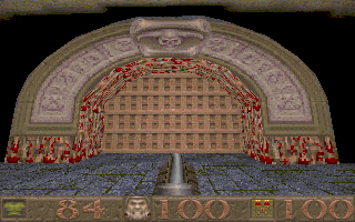
If you ever run a level and see some distant walls
turn gray or disappear completely, this is because the brush count is
too high and the Quake engine can't display all of them at the same
time. If you see this in your level, the first thing you should do is
run VIS with the -level 4 command line parameter. This will take quite
a while to run (maybe even several hours on a large map), but will
dramatically lower the brush count and the MS count. If this doesn't
get your numbers down to an acceptable level, you've got some work to
do.
Now, your first thought might be to add a wall with
a door in it to cut down on the visible surfaces, but this won't work.
In order to understand how Quake computes the number of visible
brushes, you have to understand a little about how VIS works. The way
I understand it (and I'm no expert), VIS calculates everything that is
visible from any spot on your map. When it runs, it ignores doors and
assumes that everything on the other side of the door is visible all
the time. In reality, this is true when the door is open, but not when
it's closed. As a result, your door will not reduce the visible
brushes, because Quake looks right through the door as if it's not
even there.
What that means is that you need a wall, not a
door, to block the view. This will cut down on brush count, but may
not be what you wanted in your level. One solution is to make a
blocking wall. Look at this screenshot from level E4M4 of Quake:
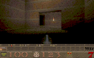
The wall with the torch on it is a blocking wall.
If it weren't there, you could run straight through the doorway into
the room beyond, but Quake would try to display all the brushes in
that second room in addition to the ones in the room you are in. In
this case, that would be a pretty big lag on the Quake engine. By
putting up the blocking wall, you limit the number of brushes Quake
can 'see' and reduce the lag.
Another way to cut down on visible brushes is to
make 90 degree hallways. Instead of connecting two rooms with a door,
make a hallway that turns 90 degrees that connects them instead. This
prevents Quake from seeing into the second room while it's displaying
the first. Water also blocks Quake's view. As long as the player is
not in the water, the Quake engine can't see what is beyond it.
If you run into an area of your map that has high
brush counts, try some of the techniques described here to cut down on
the count. Your map will run much more smoothly and your players will
enjoy it that much more.
If you run into areas that you can't seem to fix,
despite your best efforts, you probably have a CSG subtraction problem
that you need to address. That sounds serious, and it could be, but
it's usually fixable. When you use brush subtraction to cut a hole
through a brush, BSP actually splits up the original brush into a lot
of smaller brushes. It does this to keep the brush shape legal for the
Quake engine to be able to work with it.
Unfortunately, sometimes this can result in a high
brush count in a small area. To see what I mean, look at the following
screenshots:
Both these shots show the same thing. The
difference is that in the second shot, the console command R_DRAWFLAT
1 was issued. What this command does is display each individual brush
as flat-shaded, rather than textured. Notice that what in the first
picture seems to be a solid stone arch is actually made up of several
brushes. This is a simple example, but you get the idea. If you've got
an area of high lag and you can't find the cause, try this command. If
you see a lot of brushes around an area where you did some brush
subtraction, that's possibly your problem and you may have to try
making your architecture a little less complex to fix it.
Remember, the lower the brush count, the higher FPS
you'll get and the more smoothly your level will play. Keep this in
mind as you design your level and you can hopefully avoid problems
that will be hard/impossible to correct later on.
Weapon and Monster Placement
Okay, let's say you've got your level built. Every
texture is perfectly aligned. All the lights are in their place. The
secrets are well-hidden, but not impossibly so. Now you're ready to
add the monsters. If you're wondering why this section is near the end
of the design guide it's because in my opinion this is one of the last
steps to take. It's usually best to work on getting the level built
and looking good first, then populate it later. At this stage, a lot
of people will just throw a bunch of monsters in and call it finished.
This might be all right for some maps. Besides, most people just play
Deathmatch anyway, right? Well, believe it or not, a lot of people
(myself included) enjoy a good single player game now and then, and in
order to make a 'Killer' level, you've got to give as much thought to
monster placement as you did to everything else in your level.
The first thing to consider is what monsters will
be in your map. The right choice of monsters can make any level
better, just as a poor monster choice can ruin even the most beautiful
level ever conceived. For example, let's say you are creating a
medieval world. The last thing you want to do is put a bunch of
enforcers in there. They just don't belong. There are plenty of
monsters who will look and feel right at home in a castle. If you want
your level to be full of grunts and enforcers, then make a
military-style level from the beginning. Then leave out the zombies
and other medieval creatures. Remember, when a player is playing your
level, he is suspending disbelief, not throwing it out the window.
Once you've decided on the proper monsters to use
for your level, you next have to decide on their placement. As a part
of monster placement, I strongly recommend that you implement skill
levels in your map. Your map will be more widely accepted by the Quake
community if everyone from novices to the most seasoned Quake veterans
will find it challenging, but survivable. Now, this doesn't mean that
you design your level for skill 0 and then just throw in more monsters
to make the higher skill levels tougher. I've downloaded a lot of maps
only to delete them when I find myself surrounded by 4 shamblers with
nothing but a shotgun. Tough maps I like; impossible ones I skip.
What I'm talking about when I tell you to implement
different skill levels extends to more than just the number of
monsters you have. It also applies to which monsters appear in
different skill levels along with where they appear and what weapons
the player has available to defend himself with. For instance, on
skill 0 (easy), you might want to have 2 rotweilers and a grunt
waiting behind a door. The player could probably handle these with the
shotgun, but since he's probably a novice (skill 0 after all), he
might need more ammunition than a better player. Throw in an extra box
of shells to help him out. Then for skill level 1 (medium), maybe you
could change the grunt to an enforcer and take away the extra shells.
Skill level 2 (hard) could be 2 ogres and an enforcer. I know ogres
aren't really military creatures, but after all, they do have hand
grenades. Nightmare (skill 3) is the same as skill 2, but the monsters
are faster. The player will probably need a nailgun now...
Notice that the number of monsters didn't change
from one level to another; just the type of monster and the means the
player has available to him to dispatch them. Of course it's only
natural to want to make your player endure a bloodbath now and then,
and that's fine. But space them out and give the player time to catch
his breath in between fights.
There is a way to make monsters difficult to kill
without adding to their numbers. Let's look at another example. Assume
you've got a hallway, ending in a set of steps that lead up to a
landing. Now, you could put 3 shamblers in this room and give the
player the thunderbolt and let him have at it. But how about this
instead: put 2 knights in the hallway, blocking the player from
advancing up the stairs and diverting his attention from what lies
ahead. Halfway up the steps, put an ogre. Ogres work best when they
are above the player. This gives them a chance to lob death down on
the player from above. Then, up on the landing you might put a vore
who will launch guided missiles into the melee. The knights themselves
are pretty easy to deal with, but while the player is doing that, he
also has to dodge grenades raining down from above, plus deal with the
vore, all at the same time. This may sound like too much at once, but
smart players will use the monsters against each other and should be
able to handle them quite well, given the proper weapons.
Another thing to remember in monster placement: In
most cases, your map (regardless of the skill level) should start out
with the easier monsters up front and gradually build up to the more
difficult ones as the level progresses. That gives the player a chance
to get his bearings and find some of the better artifacts/weapons in
order to deal with the increased threat he will face later on. You
don't want to put your toughest monsters up front. After facing that
onslaught, anything else in your level will seem timid by comparison.
On a side note here, I actually saw a level once that had the player
spawn in the center of a ring of shamblers. Needless to say, the level
was a short one...
Miscellaneous Stuff
Here are some random tips that will make your level
better, but don't really fit in the categories above. A few of these
tips originally came from Crash's Style Guide, which used to be posted on GeoCities, but
I can't seem to find a good link for it anymore.
First of all, make sure your exit is clearly
marked, either through textures, or through a pop-up message. The
player should be able to go through the exit when he wants, not be
thrown through it inadvertantly because he didn't know it was there.
The name of your map should be less than 22
characters in length if at all possible. This makes it show up in the
right space on the status bar and not bleed over into the other areas
(obscuring the # of secrets for instance). You can make a meaningful
name in less than 22 characters.
Always include a text file with your level telling
the player how to install it. A lot of people don't need this
information, but new players will. Also, include in the text file some
kind of storyline. I like to know why I'm playing a level. Why
does that Shambler need to be killed? Tell me in a short story. This
is your chance to present the player with a unique gaming experience,
so make the most of it.
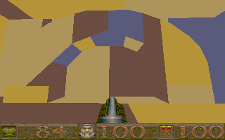
If you view the sky at horizon level, you get a
weird visual effect that ruins the appearance of the sky. Try to limit
the view of sky textures so that they only appear above the level of
the player. If you've ever seen it, you know what I mean, and it looks
really crappy.
The End
Well, that wraps up my thoughts on level design.
Like I said at the beginning, these are my personal feelings on the
subject and should be taken as such. If you disagree with anything I
said here, feel free to do so. You may have better ways of doing
things than I do; that's fine. I'm not trying to change the way you
make maps. I just wanted to point out that there are several factors
to consider when designing a good level. It's not enough simply to
know how to use BSP; you've got to know what makes a level fun and
entertaining in order to make a truly Killer level!
This site is designed for 800x600 resolution, and is best
viewed in Netscape 4.0 or above with 16bit color or higher.
BSP is the sole creation of
Yahn Bernier. I am only a
dedicated user, reporting news and making tutorials so Yahn can spend more
time enhancing BSP.
This web page was created and is being
maintained by me (DeadMeat). Unless otherwise noted, all content appearing on this site
was written by me. Also, 'DeadMeat's BSP Tutorials' were created entirely by me. All unauthorized use is
prohibited. (c) 1997. So there :-P